|
By Daria deGolian, Designer La-Z-Boy Spanish Fort, Al
As beautiful as a neutral, black and white room is, I have to admit that many of us may grow a little bored without any color at all. Plus, color is a mood booster! Five ways |
|
The combination of BLACK & WHITE is popular with graphic designers and marketers to deliver powerful and clear messages. The fashion industry embraces black and white year after year! But when we think of decorating, we usually think of COLOR.
So, why on earth would you decorate a room with no color? Here's why!
|
black and white
creates
THE ULTIMATE BALANCE.
But when placed side-by-side
the two colors enhance each other.
black becomes darker
and white is highlighted.
The results are clean, crisp and contemporary.
Black and white are beautiful
separately...
and beautiful together.
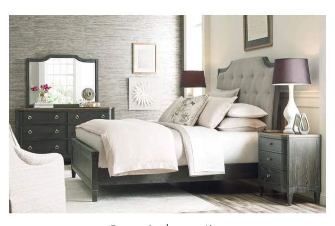
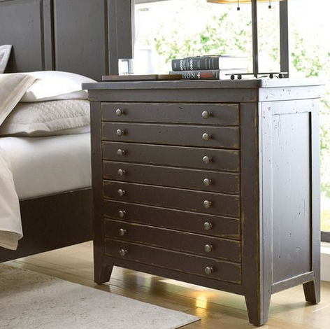
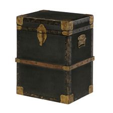
Bedside tables work well in black...
Mill House Map Drawer Bedside Chest - Anvil Finish
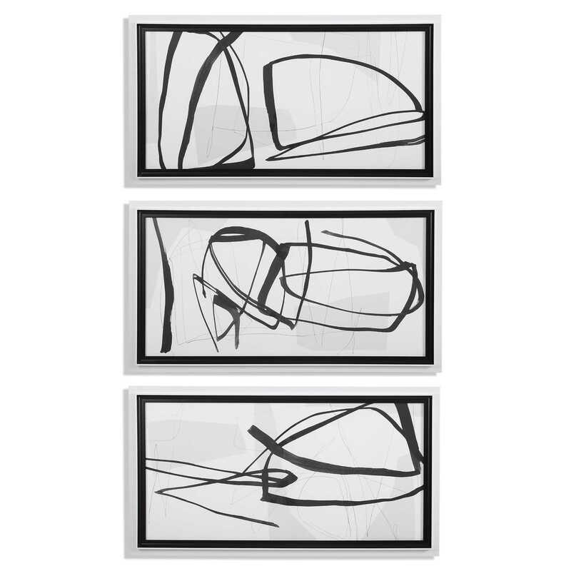
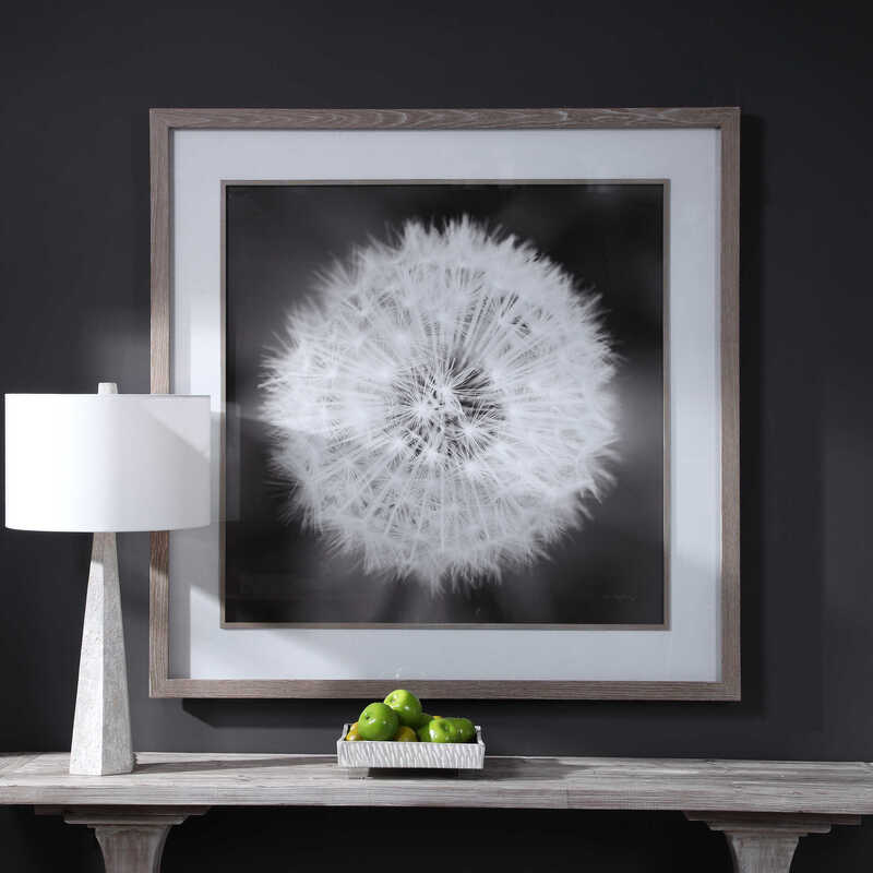
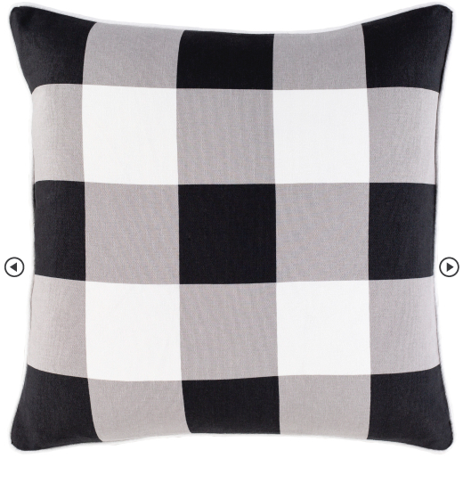
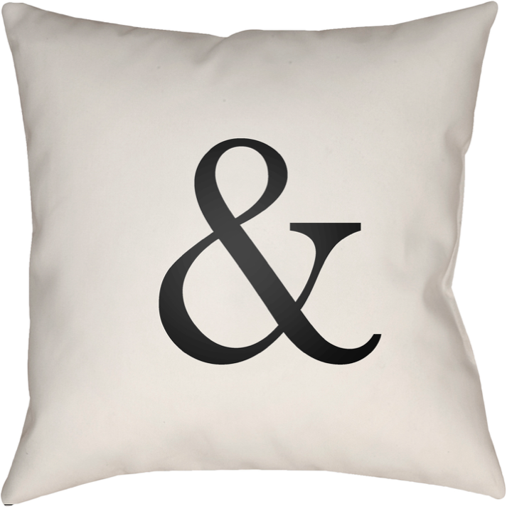
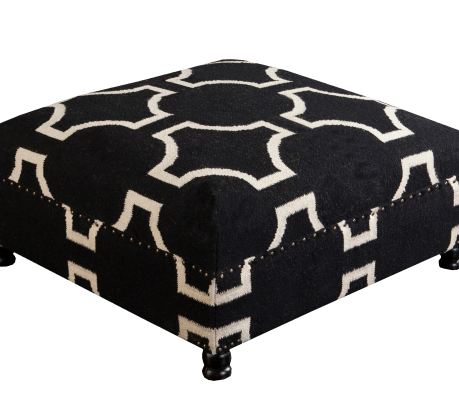
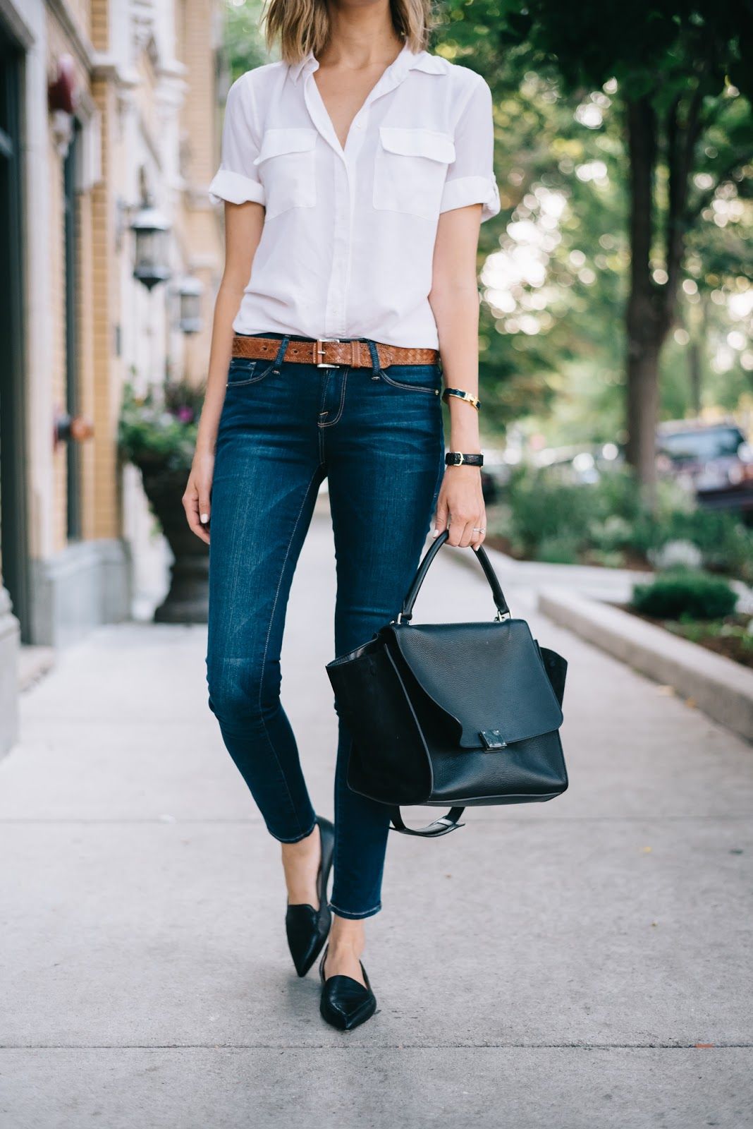
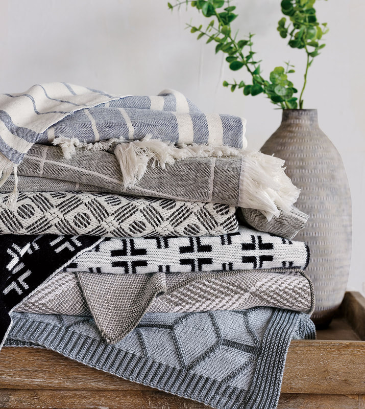
Get drama and spark with black and white accents and accessories!
can use a touch of black!
Strange idea for a room of pastels or jewel tones? Think for a minute…. using the color black adds a focal point of color that grounds, anchors, and adds a sophisticated look to a room.
Many may find a room of black and white to need more. So in my next post - on Friday, August 28 - I'll give you ideas on how to jazz up your black and white room with pops of color, and also anchor a colorful room with pops of black!
La-Z-Boy Mobile, AL
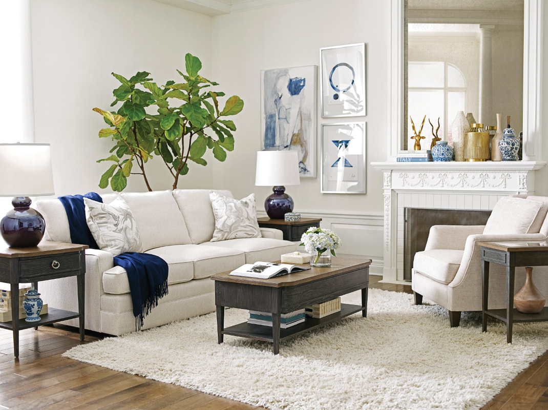
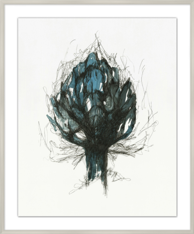
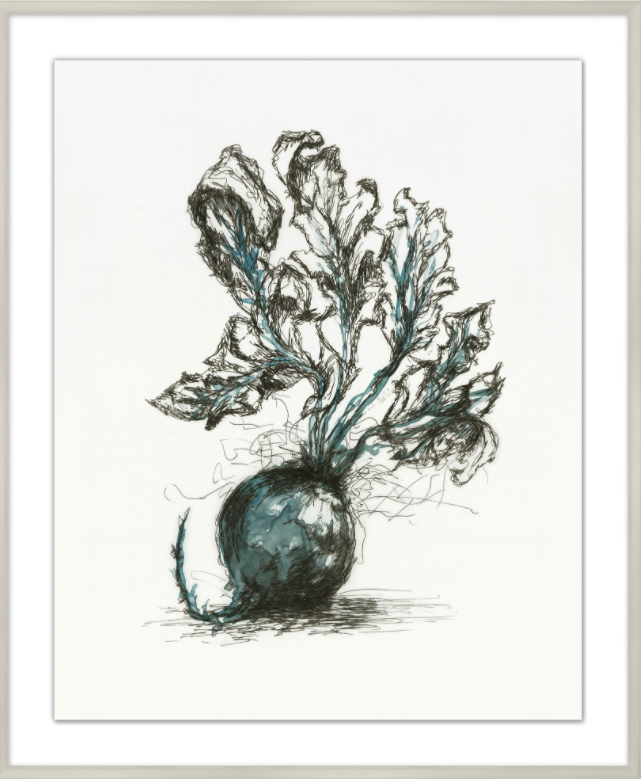
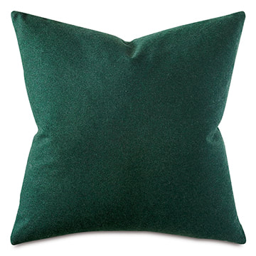
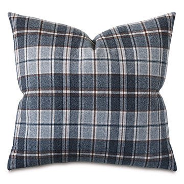
The navy + green color combo gives these La-Z-Boy living rooms an organized look...so calming!
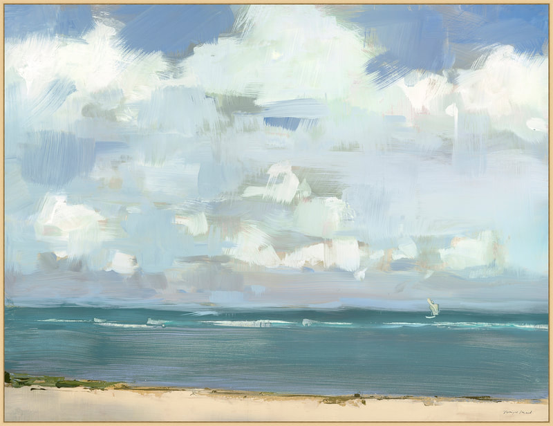
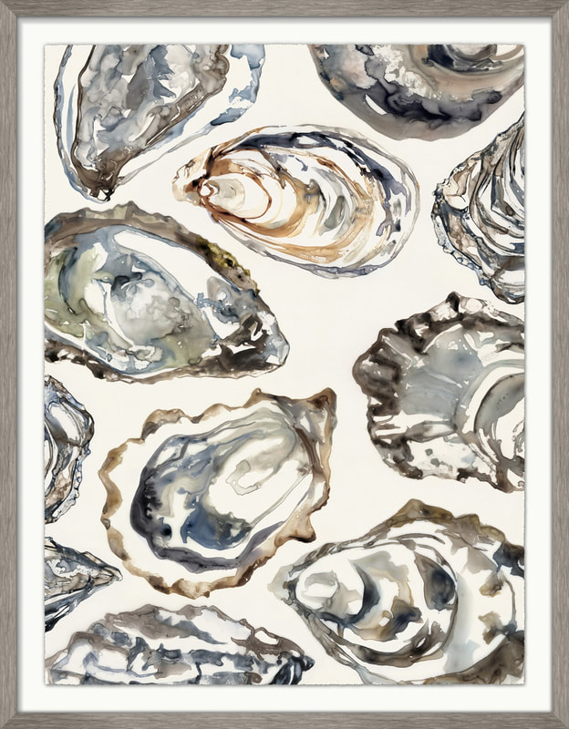
Wall art
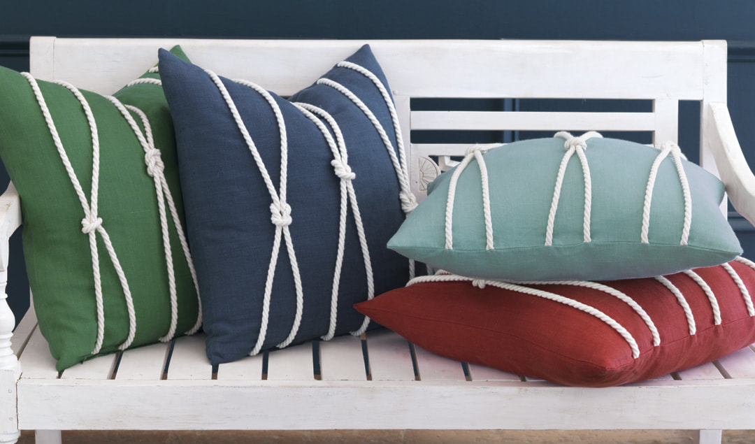
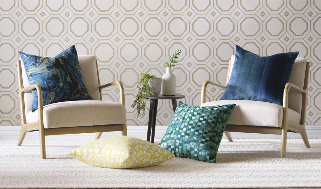
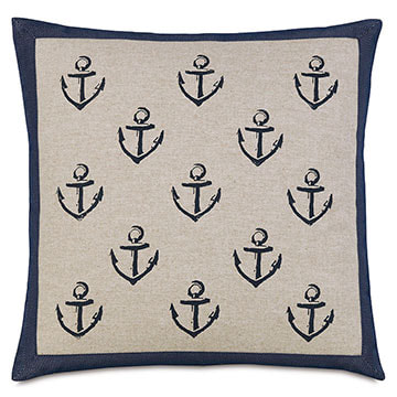
And, of course, the pillows!
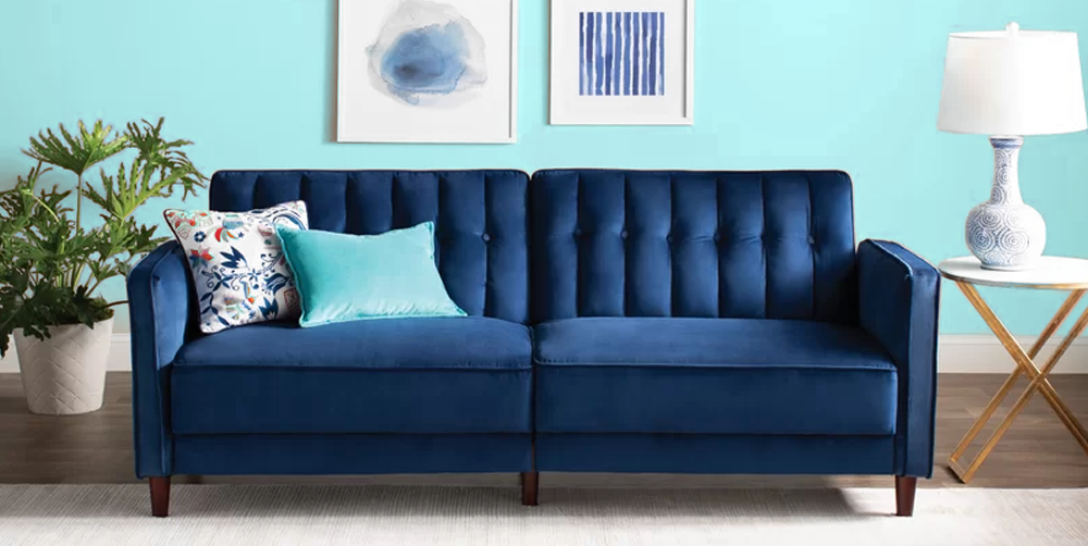
A surprise pairing... Sailor Navy & Mint Green
This is a surprisingly cool color combination because it is unexpected. This sorbet mint is fresh, zingy and very much on-trend. Pastels have been prominent for some time now and show no signs of diminishing. The inky navy color is deep, rich, and almost masculine. Together, the result is so elegant and interesting!
Order your free La-Z-Boy swatches!
When in doubt, stick with nature ―
bad color pairings don’t happen there.
| The Merriam-Webster Dictionary says GREEN is youthful, vigorous, vigorous, fresh, new. It is considered the color of life, of renewal, prosperity, and harmony. |
Green symbolizes hope and growth!
There no downside to this color of nature!
| GREEN can set the mood. Whether you want to paint your walls green or invest in an eye-catching piece of green furniture, the shade of green you should opt for depends entirely on the mood you want to set and the space you are trying to fill. |
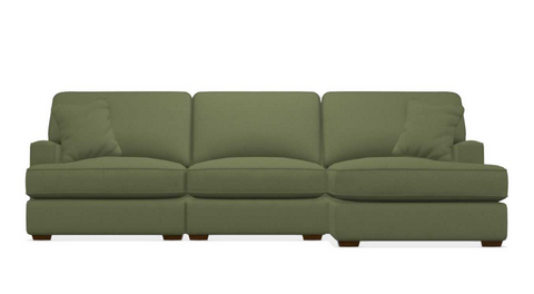
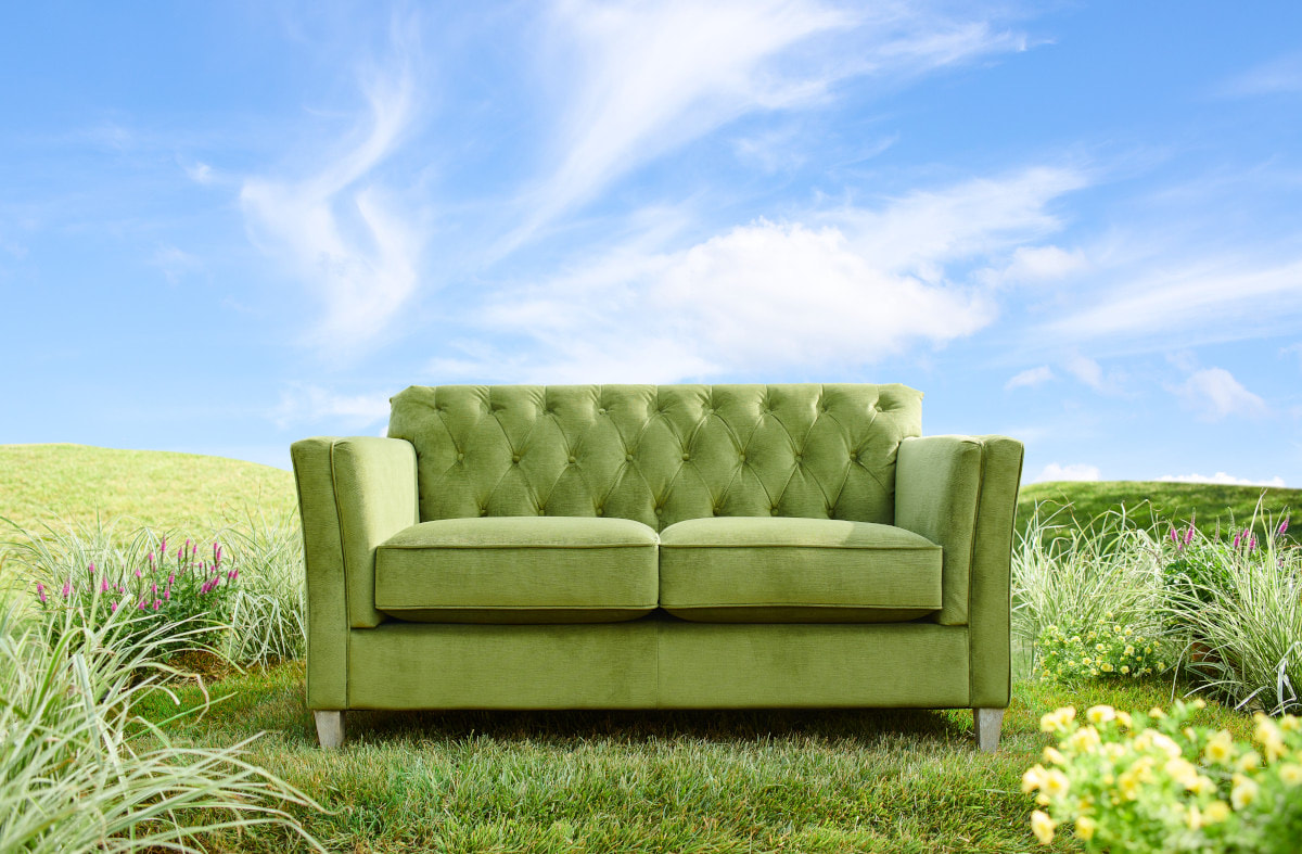
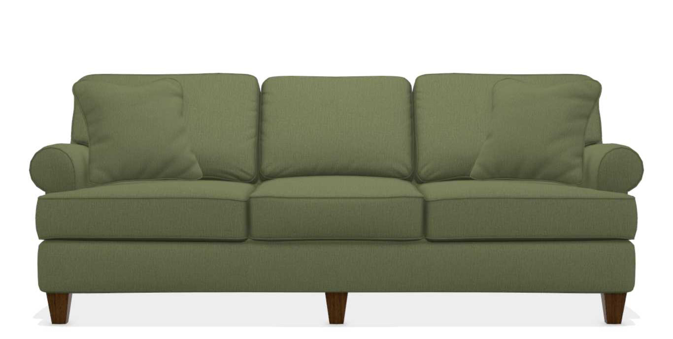
THE PORTER SOFA
In Moss
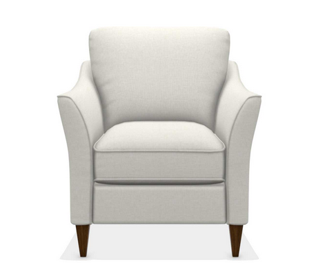
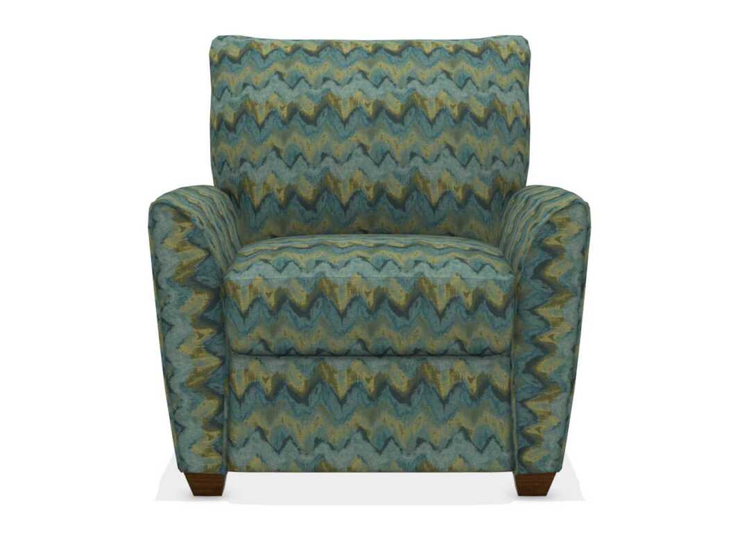
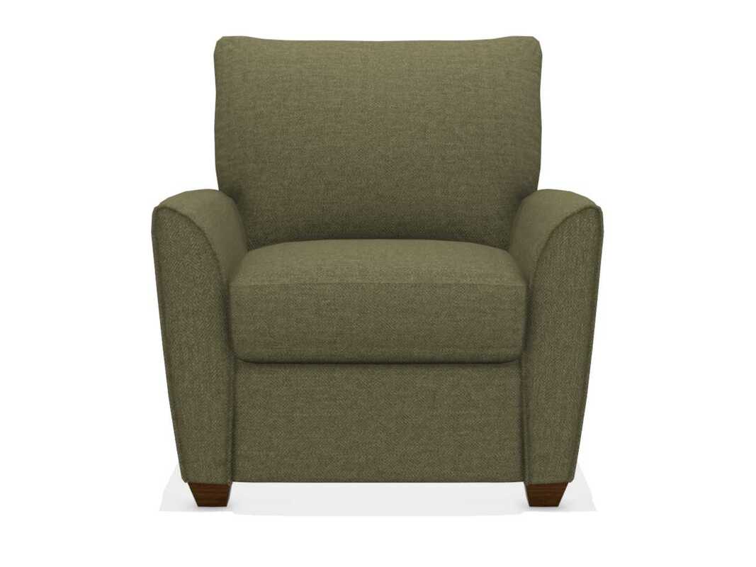
The Amy Chair
In Dragonfly
In Flagstone
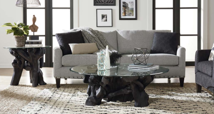
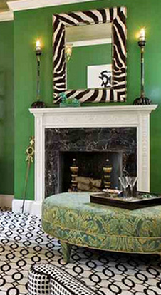
Be sure to include color, pattern, and texture!
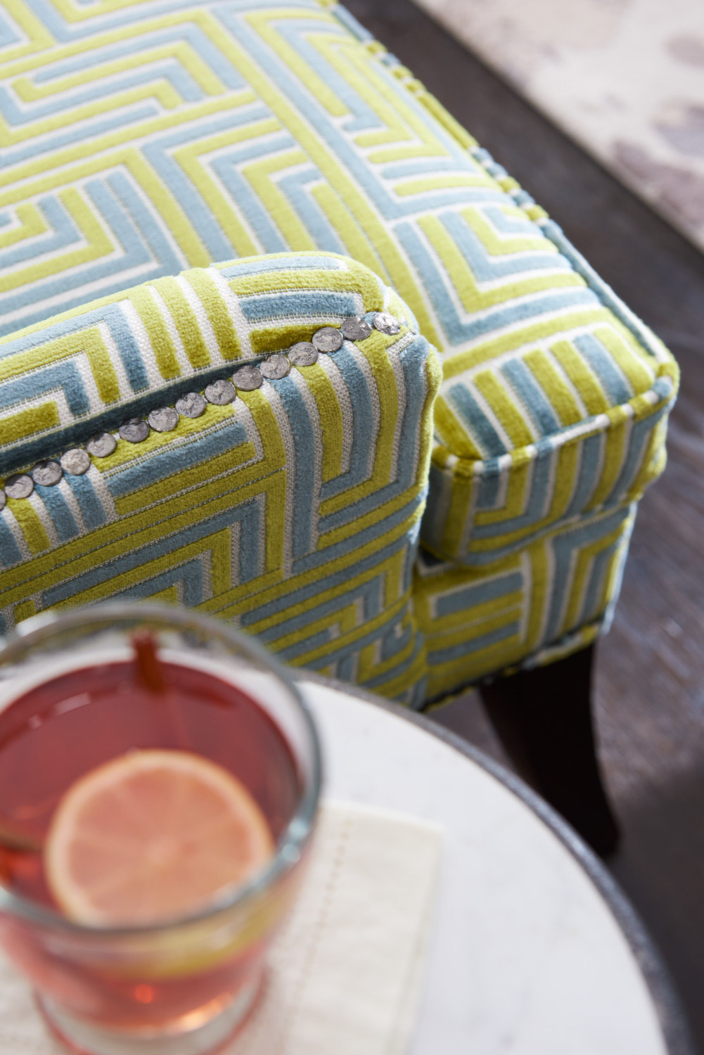
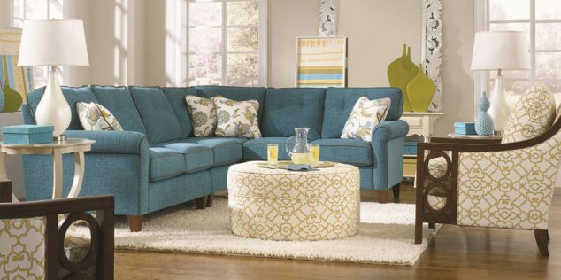
This room combines the colors of green and blue through patterns and varying textures pleasing our senses of touch and vision.
It's all about how the room looks and feels.
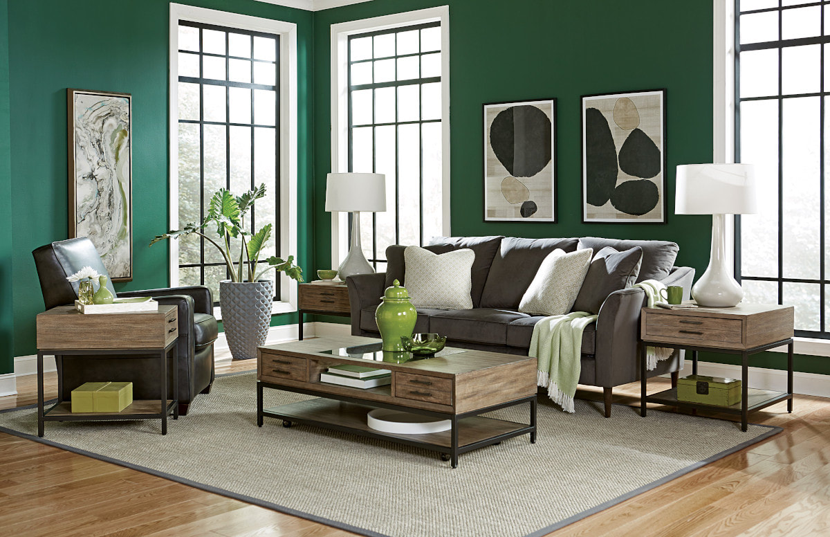
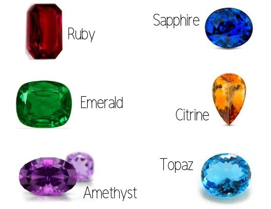
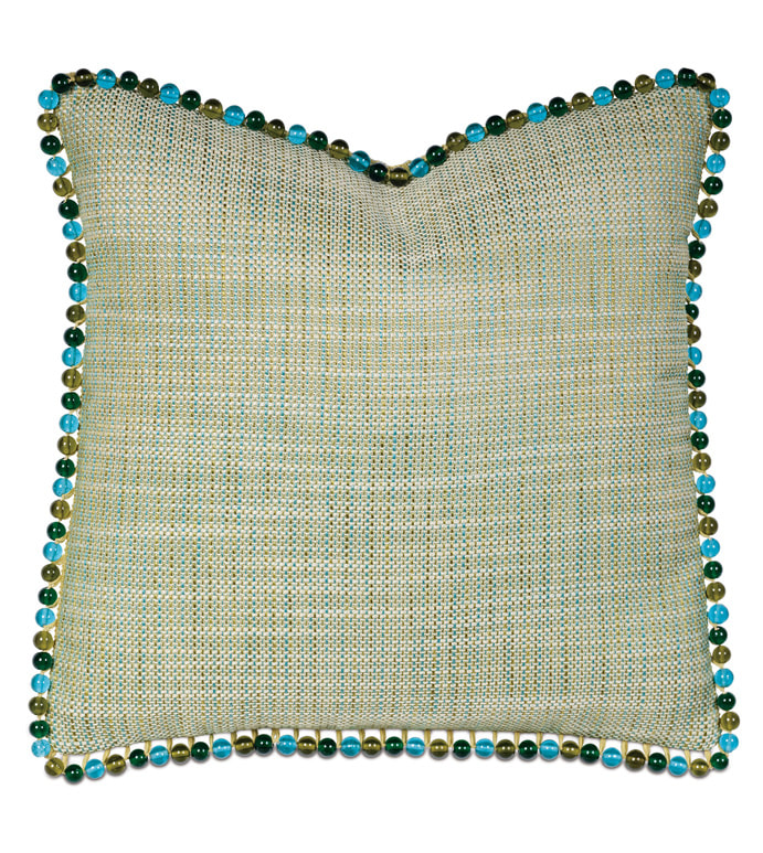
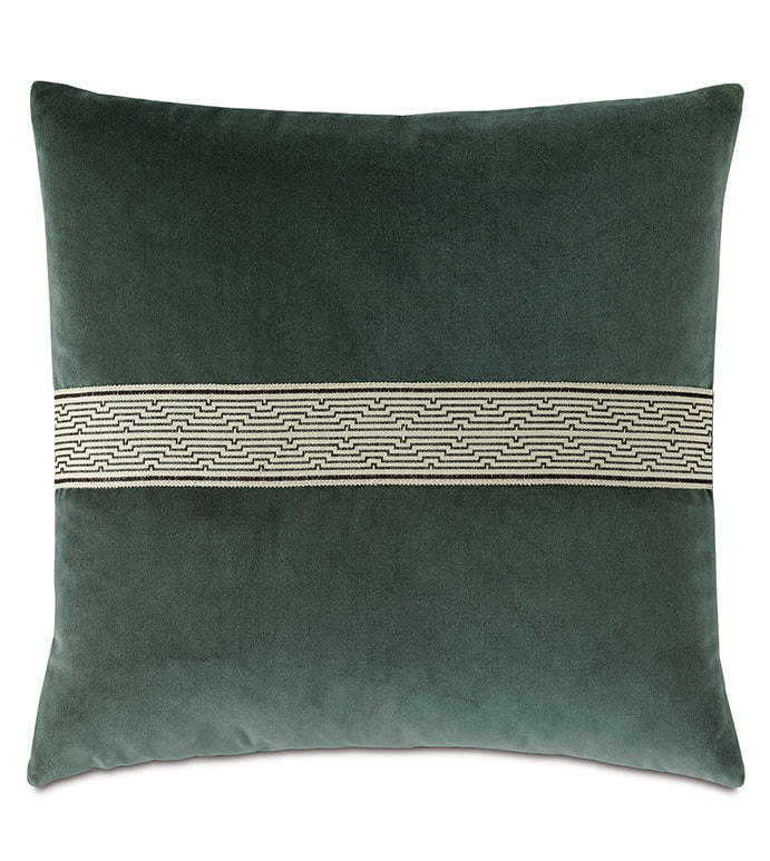
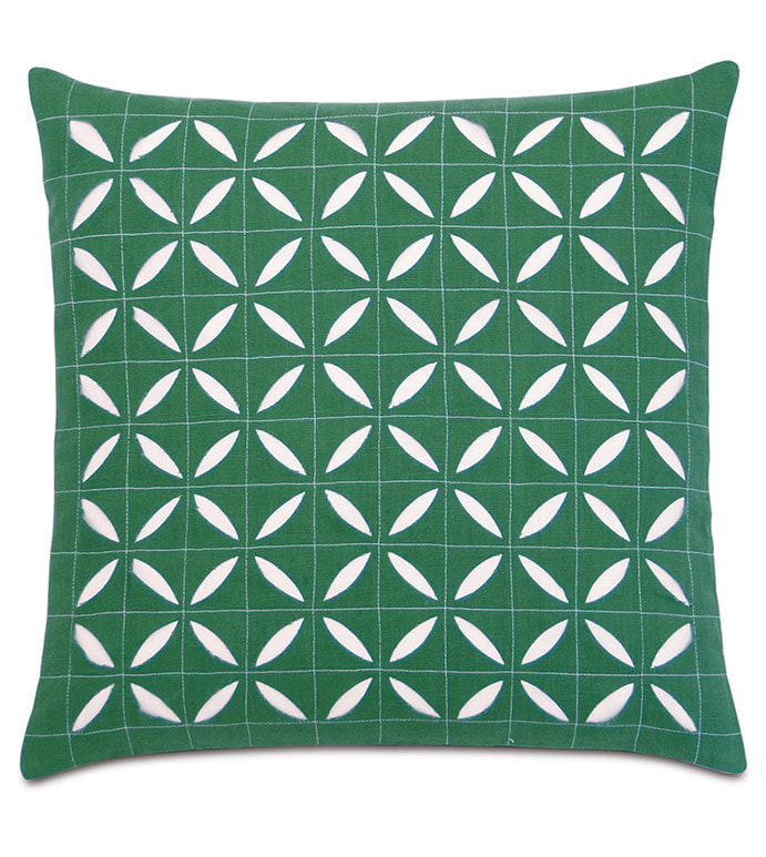
| Jewel tones are named after stones like sapphires, emeralds, amethysts and rubies | A dark, jewel-toned green is the perfect backdrop or casual addition for a moody living room or bedroom. It instantly creates a sense of elegance, no matter the size of the space. Embrace the jewel-toned look with a pile of green throw pillows atop a La-Z-Boy sofa or loveseat. A deep green makes a statement, so even a single piece of furniture can set the stage for the rest of the room. |
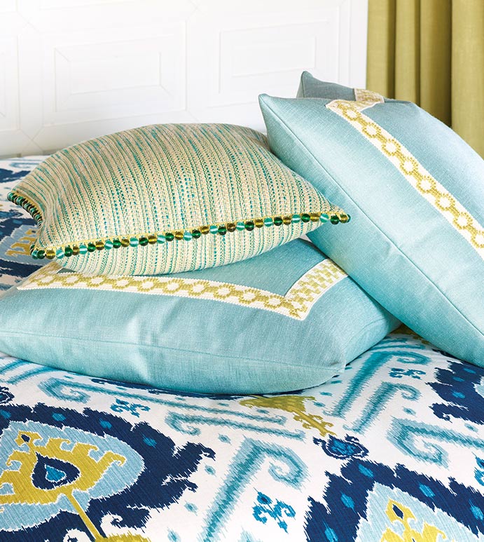
In the photo above, one pillow is free flowing with an open background.
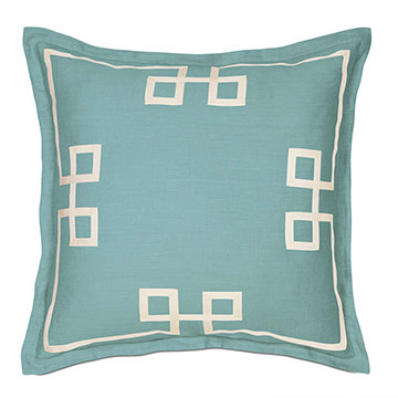
And notice the solid fabric trimmed with a classic border.
Oh, those drapes...bold pattern!
GO BOLD!
Each surface...Color...Pattern
The wow factor!
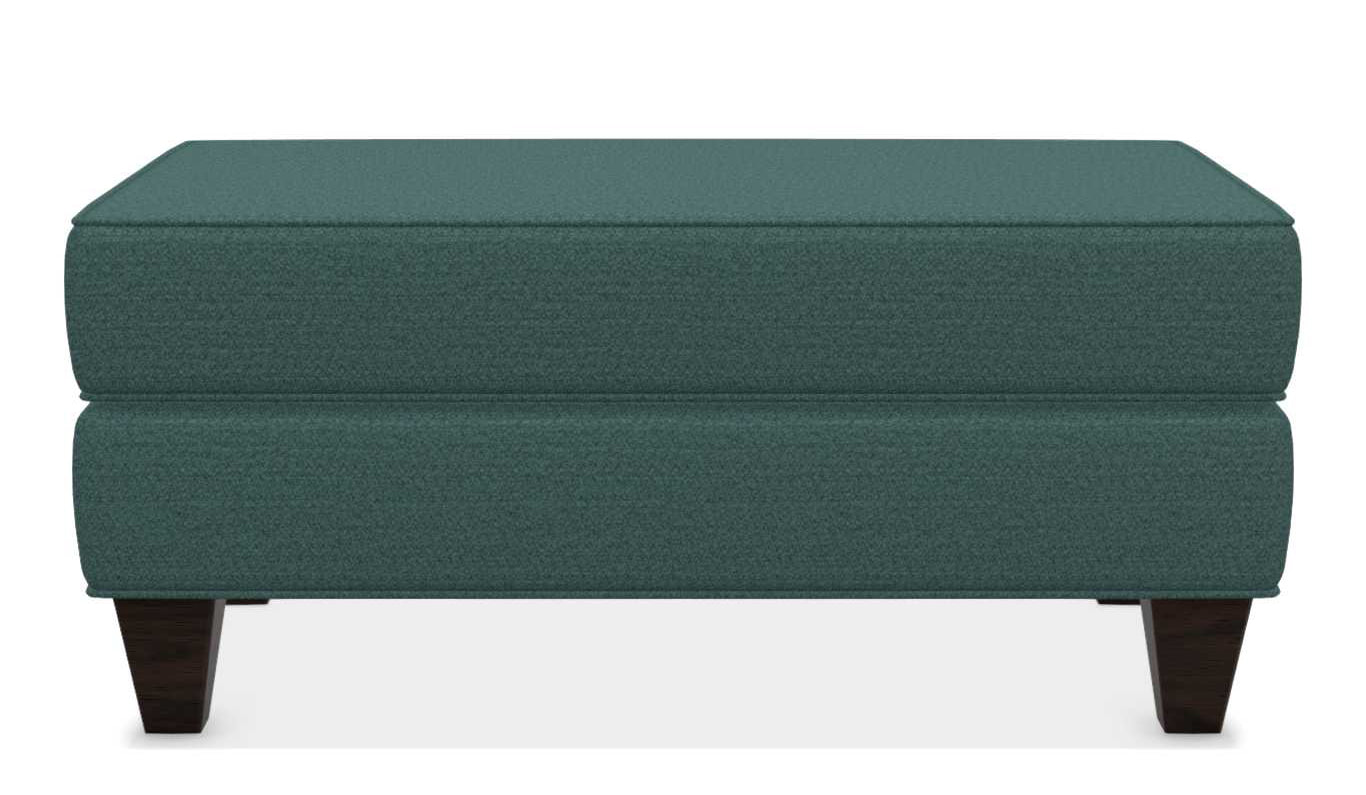
The Laurel Ottoman
In Jungle
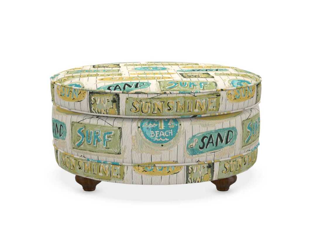
The Coronet Storage Ottoman
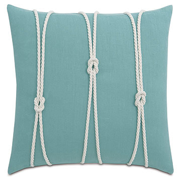
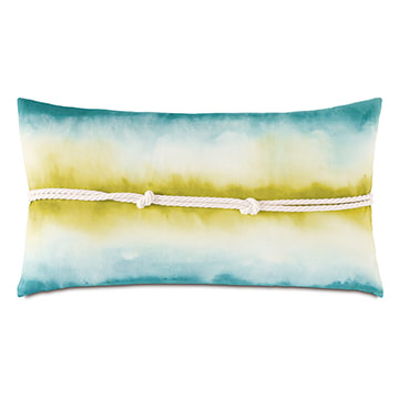
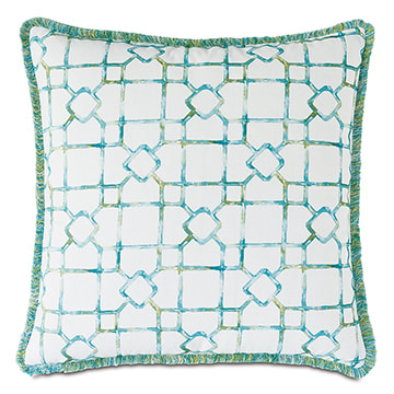
Fun for the beach or bay!
PILLOW AND THROWS IN GREEN
... OH MY!
Green...more than cool?
| GREEN can be both warm and cool, depending on the shade, but often lands more on the cooler spectrum. You'll often find other cool shades that derive the "coolness" from green undertones. But while the majority of greens are cool, there's a wide variety in green and will often feel vastly different depending on the room and natural light. |
A Short History of Green Pigments Green is not a primary color, but is created by mixing yellow and blue. Green pigments have been used since Antiquity, both in the form of natural earth and malachite, used primarily by Egyptians. |
| Greeks introduced verdigris, one of the first artificial pigments. Until the 19th century, it was the most vibrant green pigment available and was frequently used in painting. Copper resinate was introduced in European 15th century easel panting, but was soon discarded because in the presence of light and air, green copper resinate turns brown copper oxide. Thanks to chemistry, a new generation of greens was introduced beginning in the late 18th century: cobalt green, emerald green, and viridian. | |
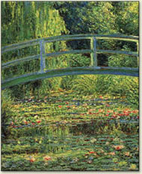
| In his painting “The Japanese Bridge,” 1899, Monet uses the color of hope together with the symbol of a bridge. The bridge stands for the uniting of people and revives hope for a peaceful future. Incidentally and sadly, Monet’s use of Emerald Green pigment, which contained arsenic, may have contributed to his blindness in later life. |
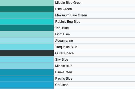
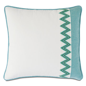
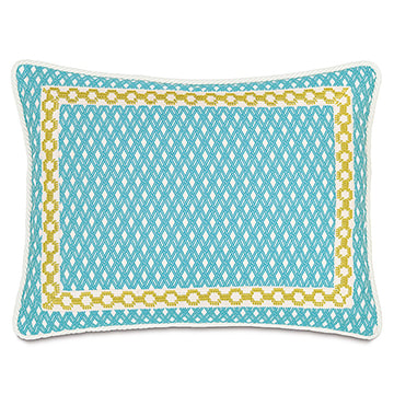
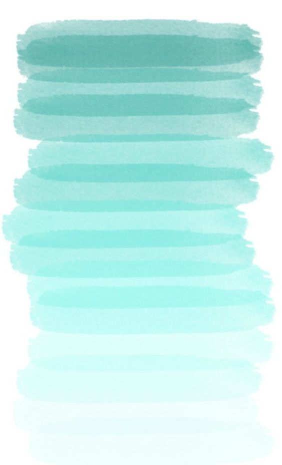
| AQUA is universally loved as a color. It's the color of the sea and the word, aqua, is Latin for water. Many of us associate this greenish-blue color with our coastal beaches and panoramic water views. So it's only natural for us to feel comfortable with the color aqua in our homes! |
Which crayon color do you like best?
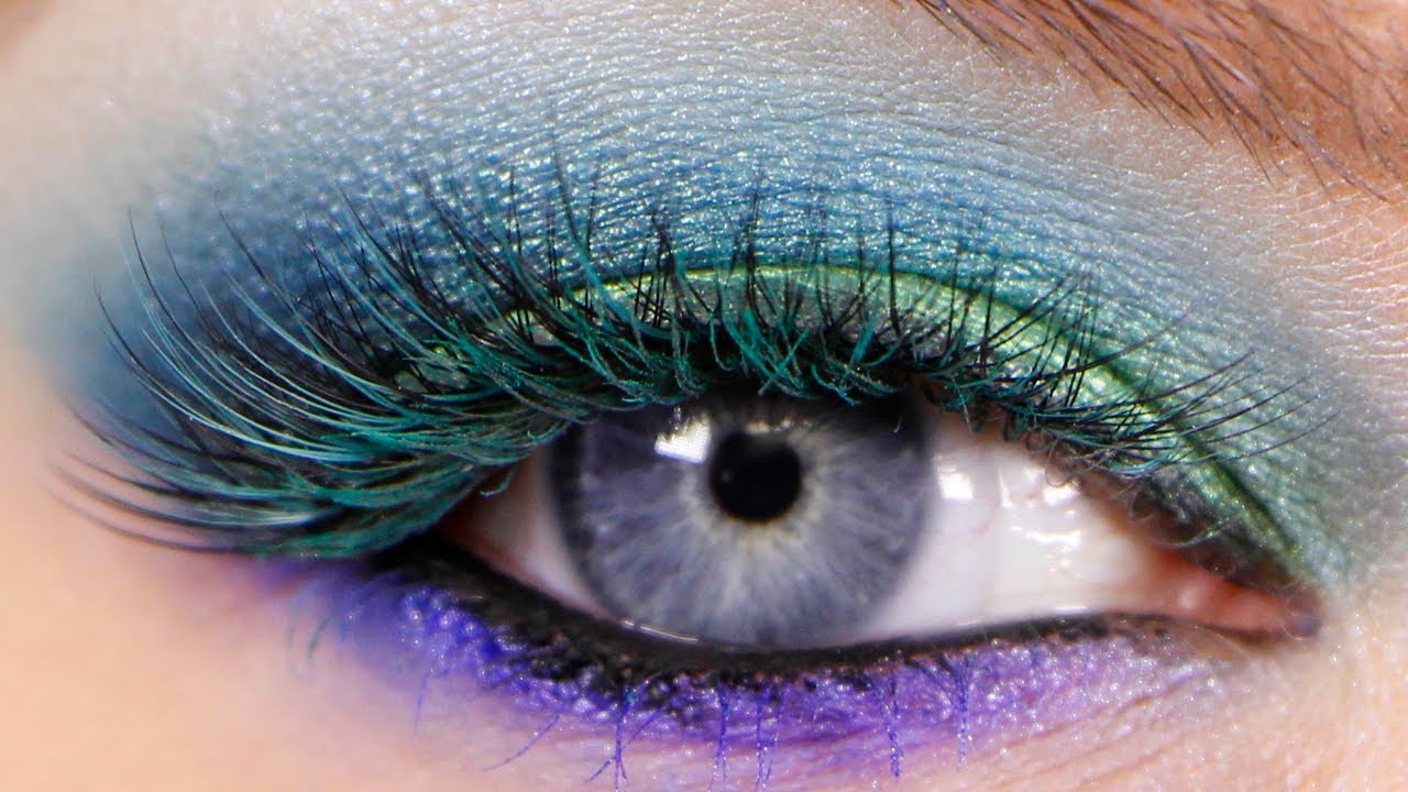
The psychological effects of aqua..
Closer to green than blue, aqua is refreshing and uplifting. It is creative and light-hearted, yet strong and individual.
Aquamarine
The color aquamarine calms and balances the mind and the emotions, enhancing creativity and inspiration.
Big brands know how aqua makes you feel...recognize these logos?
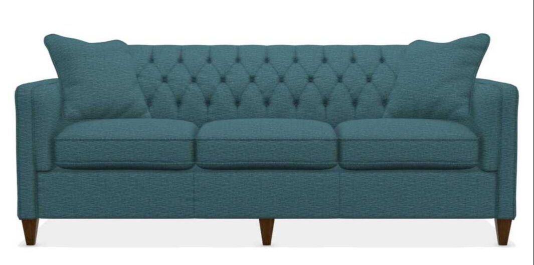
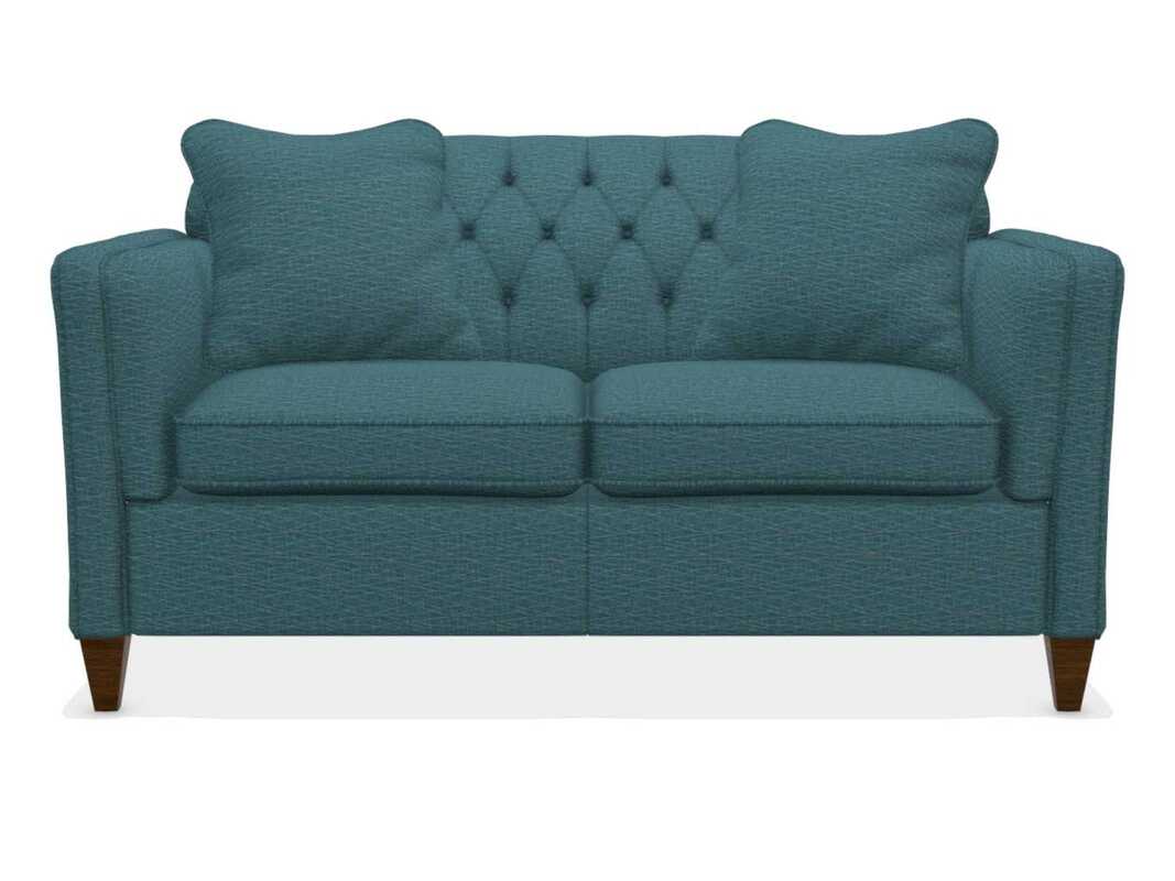
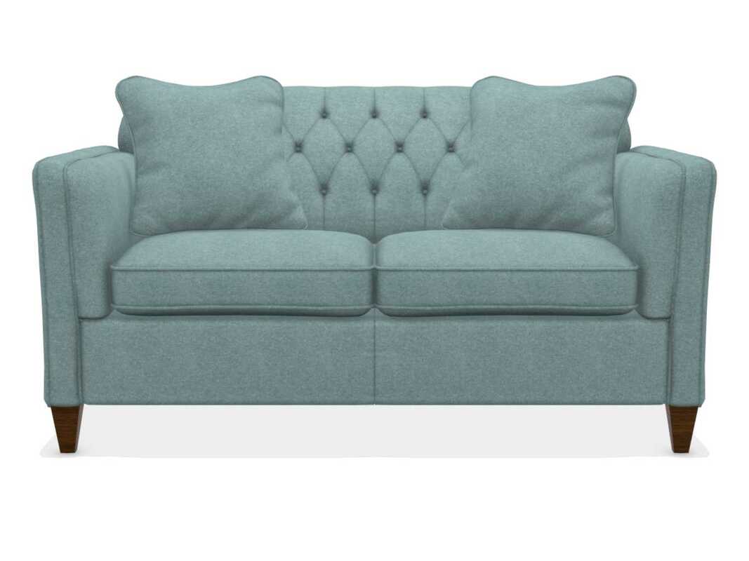
The Alexandria Sofa and Loveseat
In beautiful, cool Marine
...and tranquil Seafoam
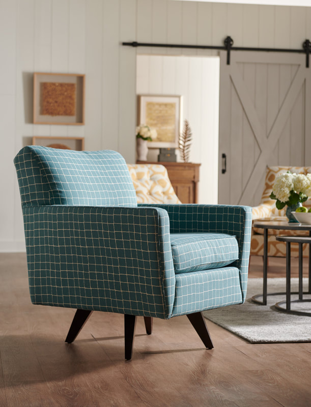
The Bellevue
Fresh and Modern
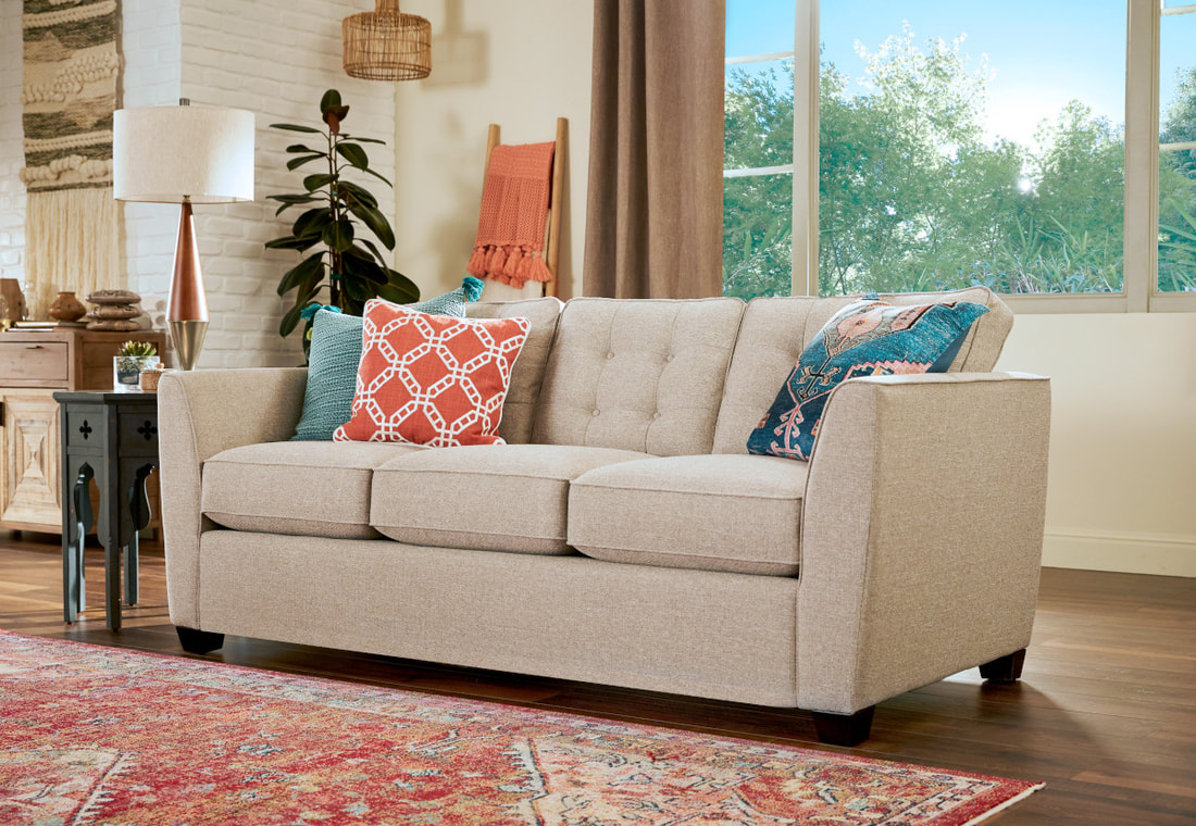
AQUA MEETS ORANGE!
|
Mercer: "I have used a pale aqua in a client's home on the walls with a lovely creamy beige trim to open up a small room that was on the dark side of the house. The cool soothing color completely changed the feeling of the room from one of a cramped small bedroom into a spacious home office. Try some aqua in your home to freshen up your room!"
|
| Color is the one thing that scares clients the most BUT it's also the one thing that will make your home fun, exciting and give it a personal stamp! In this blog post, I have so much to say about the regal color purple: how the color is mixed, how to use it in your home, plus I've added a fun color game to play! (see end of blog). |
| Blue-purples are cool | Pure purple is neutral | Red-purples are warm |
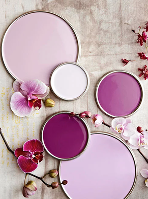
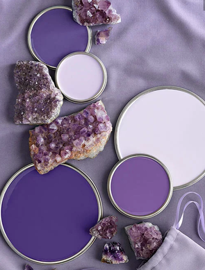
| What exactly is Purple? Because purple is a secondary color, it is the result of mixing two primary colors together. To make a shade of purple, you would mix red and blue together. If you mix an equal amount of red and blue together, you’ll have violet, a tertiary color and a mixture that is known as “pure purple.” If you mix together different amounts of red and blue, you’ll create hues that are redder or bluer, depending on the ratio. | Different Shades of Purple Beyond pure purple, you may want to create different shades, such as lavender or aubergine. Remember that pure purple is a 50/50 combination of red and blue. To make lavender, which is a light shade of purple, your aim would be for 50 percent blue and 50 percent red, cut with white paint. To make aubergine, a darker hue, you’d want 51 percent red, 43 percent blue and 6 percent black. A plum color requires 41 percent red, 39 percent blue and 20 percent green. |
TOO MUCH INFORMATION?
Well, just rest your eyes on these beautiful
LA-Z-BOY chairs and sofas:
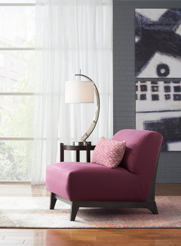
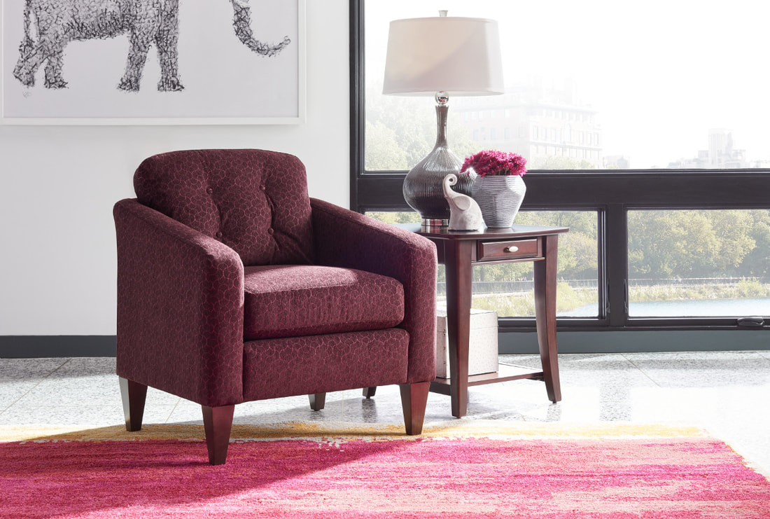
PURPLE!
Plop it in your living room...
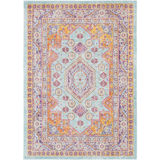
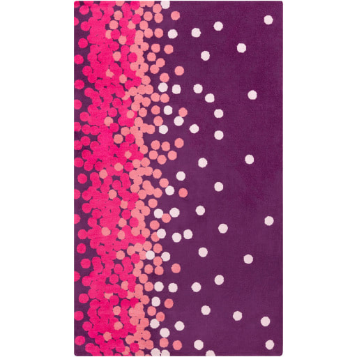
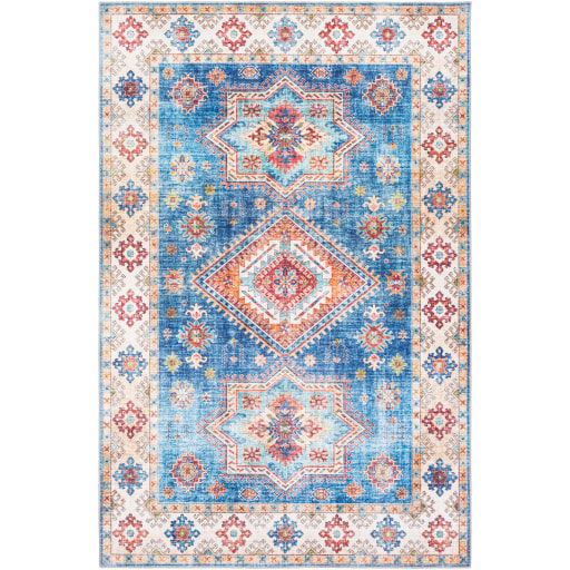
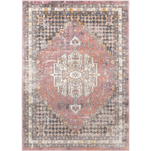
Slide in a rug...
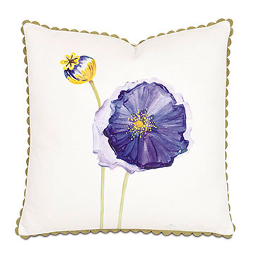
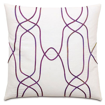
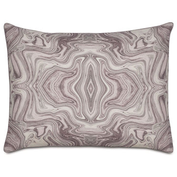
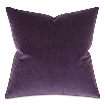
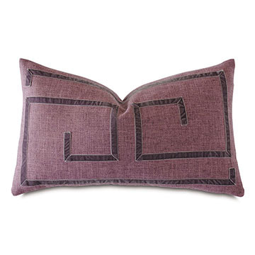
...add some pillows!
Purple Points to Ponder
|
The earliest purple dyes date back to about 1900 B.C. It took some 12,000 shellfish to extract 1.5 grams of the pure dye - barely enough for dying a single garment the size of the Roman toga. |
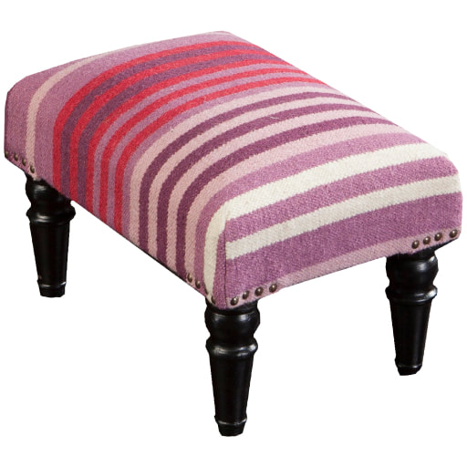
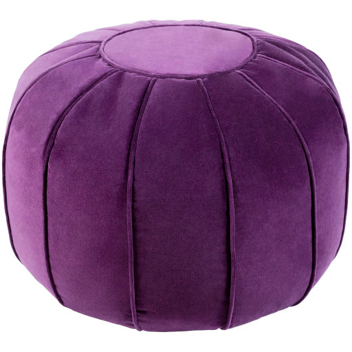
Purple Accessories
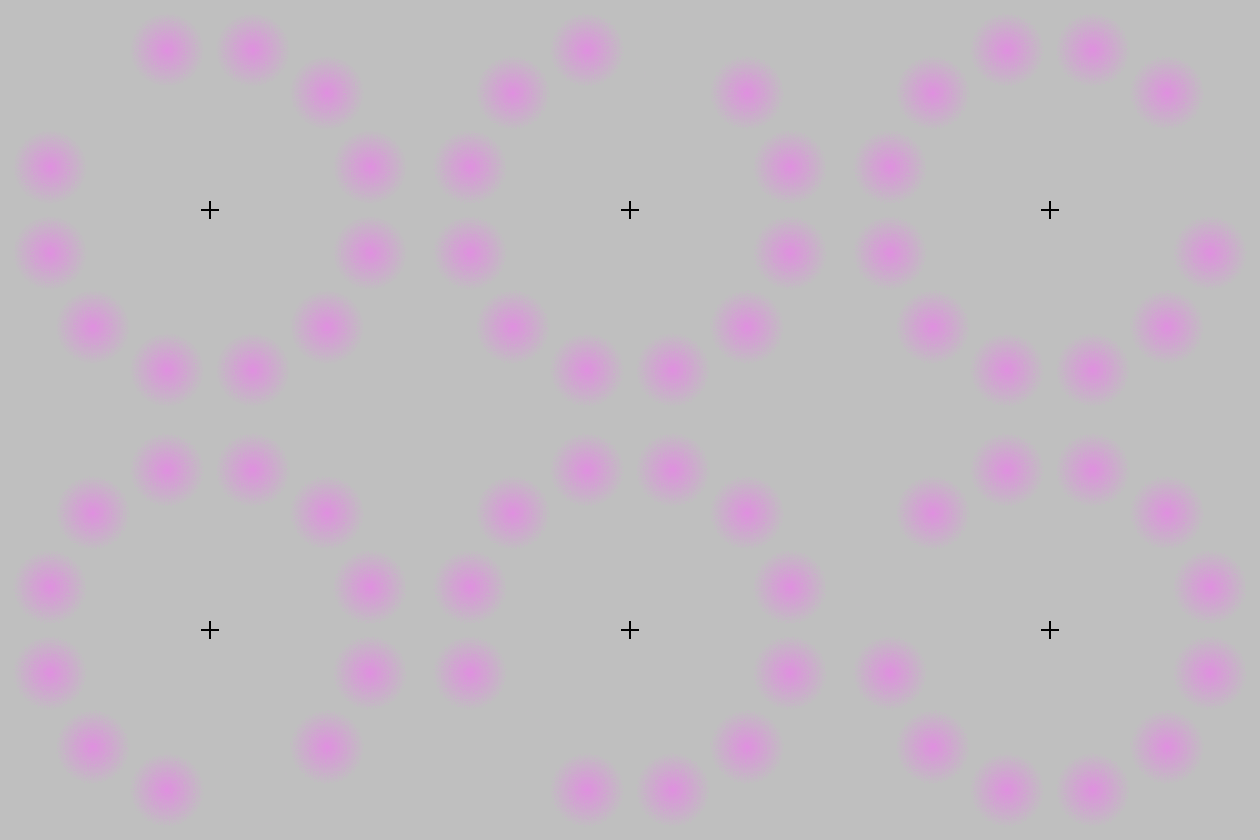
on the central fixation cross (plus sign.)
Keep staring at it for a bit.
With good fixation, you should see a strong greenish color
whenever the violet patch has disappeared!
More about this optical illusion
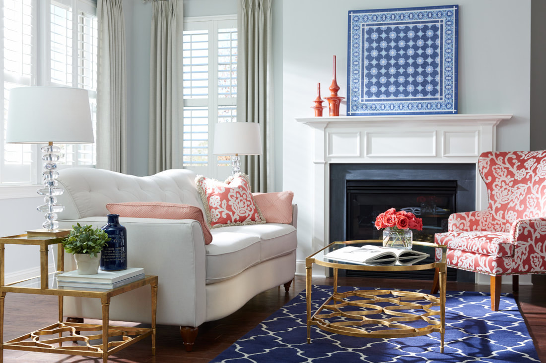
The color navy is sophisticated and dark, and can stand up to any bold color. But when paired with white, the crisp duo of white and navy can really make a statement in any space of yours.
Designer, LA-Z-Boy Spanish Fort
| SPANISH FORT, AL - Happy Friday! In my blog post earlier this week, I talked about decorating with the color NAVY. Yes, its a bold and dark color but it is an amazing color...it can stand up to any other bold color. But my favorite choice is to pair navy with WHITE! |
AND
it works in just about any space in your home!
Some of my favorites...
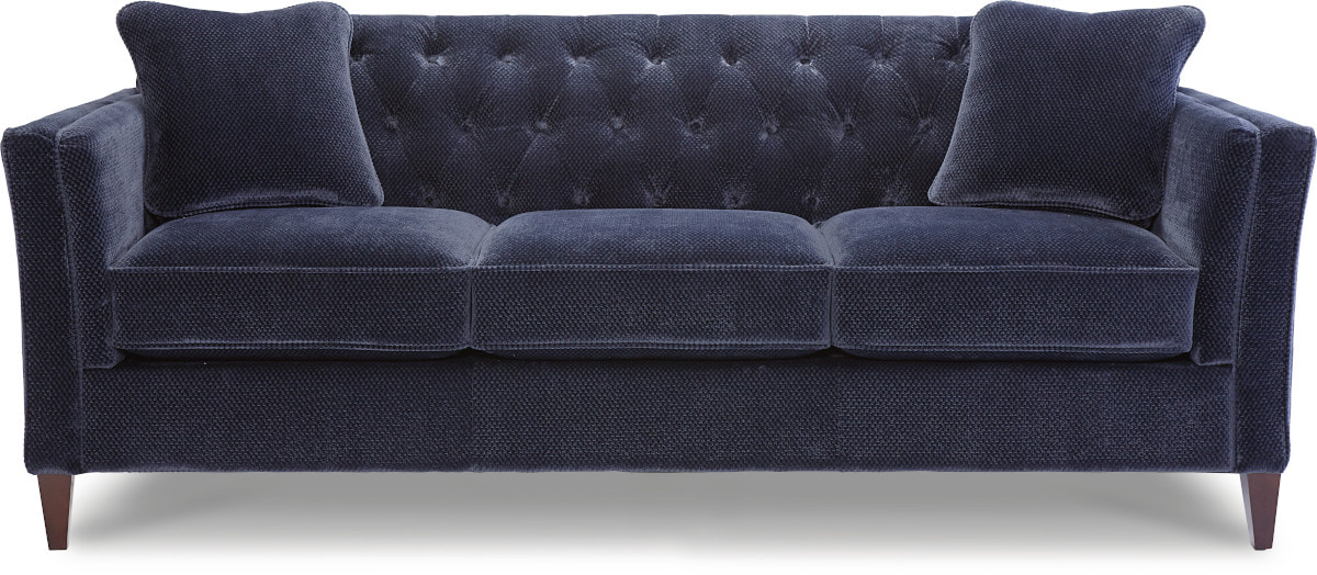
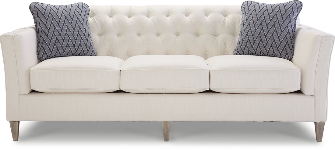
The gorgeous Alexandria Sofa
- Button tufting in a diamond pattern that’s both distinctive and unique
- Extra cushioning softens the sloped rolled arms - gives it a modern twist!
- Slender, tapered wood legs
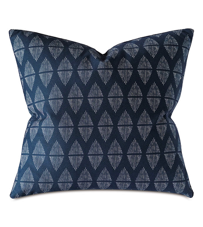
...crisp white with navy pillows...
so luscious.
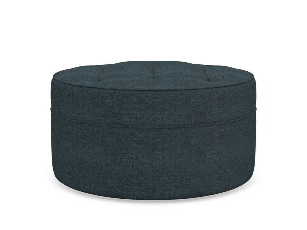
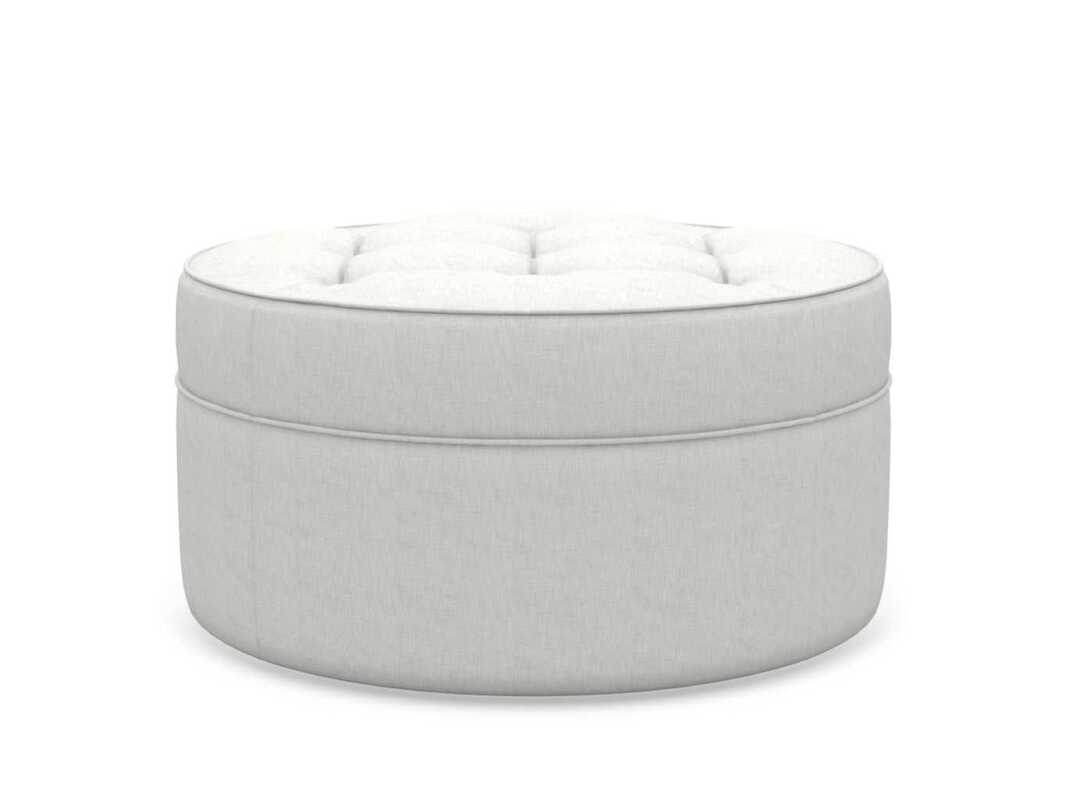
Roundabout Ottoman
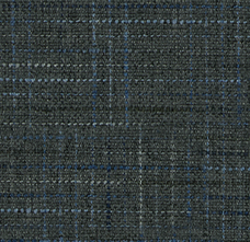
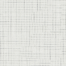
Many fabrics and colors are available...here are two of my favorites - navy and parchment white!
| NAVY Becker is a stylish base cloth with the appearance of a finely woven wool suiting fabric. | PARCHMENT Champ fabric combines a casual look with cloud-like textures that must be experienced to be appreciated. |
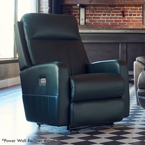
The Finley Wall Recliner
- USB Charging Port
- Two Memory settings
- Can be placed mere inches from a wall
- Neat structured look for contemporary style
- Multiple fabric choices and upgrades
Navy and White Accessory Color Pops!
THE COLOR NAVY
Cool and neutral, but also calm and powerful!
 DARIA deGOLIAN, DESIGNER - LAZBOY SPANISH FORT LOCATION
 LA-Z-BOY, SPANISH FORT, AL
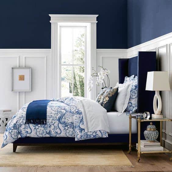
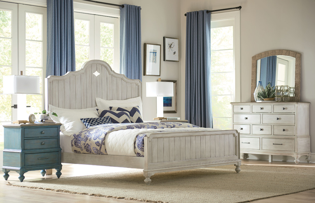
The master bedroom can sometimes be one of the most ignored rooms in the house for decorating. But think about how many times you go into your bedroom besides to sleep... you may take a phone call there, watch tv there, get away from the kids there, take a quick nap. Why should it be ignored or at best, somewhat overlooked?
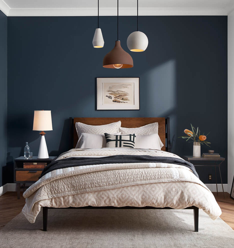
Although navy is considered a cool or neutral color, it also evokes a sense of calm and power at the same time! Because of its eclectic subtlety, navy blue can truly blend into any personal style tableau for the ultimate master bedroom. A rich shade of navy blue paint can instantly shift a room into masculine mod. By matching bedding and furnishings, you'll transform your bedroom into a place of stoic peace and worthwhile pursuits.
Pristine white bed linens add a fresh, airy ambiance to brighten your bedroom while providing a crisp color contrast against navy blue walls. The white bedding can also make a room with dark-colored walls feel large and more spacious.
Whether you love the classics or live for the latest trends, La-Z-Boy Gulf Coast has you covered from beds to sofas to accessories.
MAKE A PEACEFUL SPACE IN THE CORNER
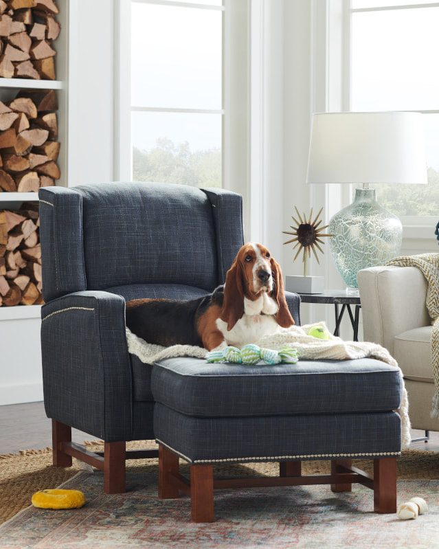
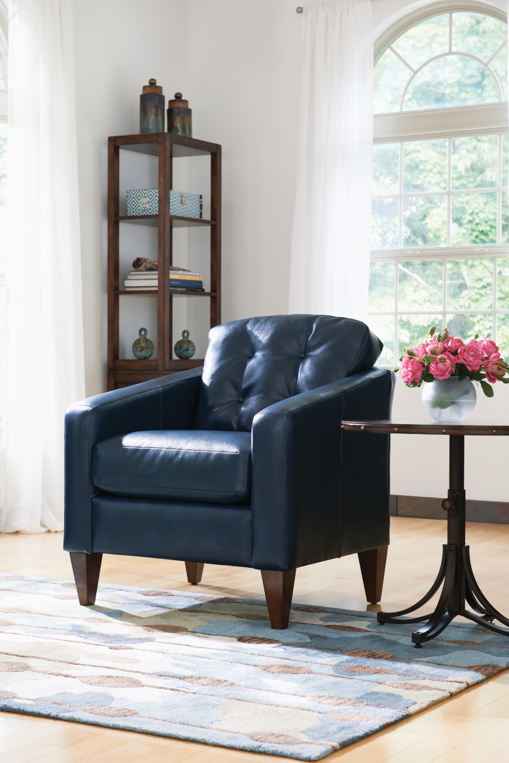
Choose a comfortable LA-Z-BOY chair to get away for some quiet time...
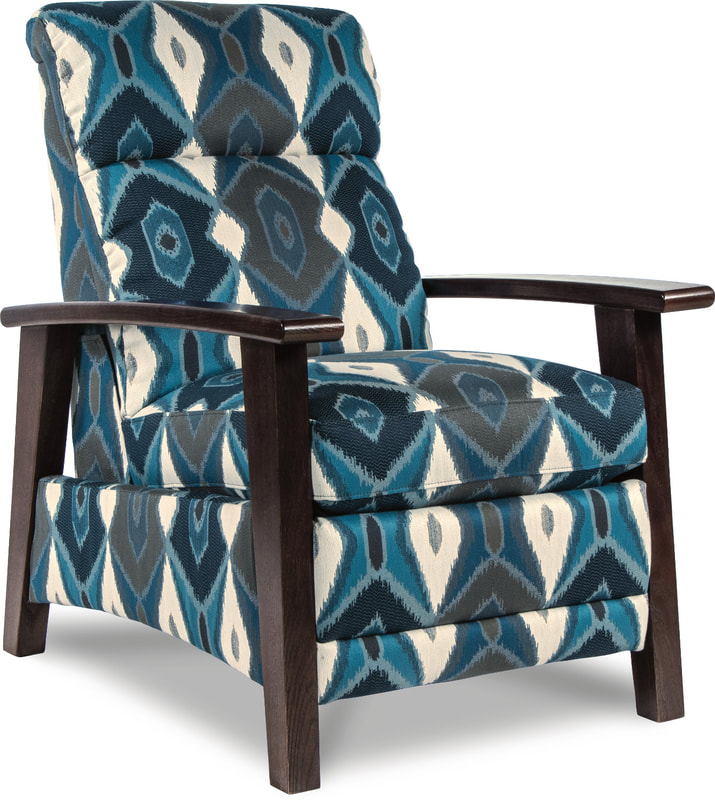
THE NOUVEAU
IN NAVY AND TEAL
|
FACTS ABOUT THE COLOR NAVY...
|
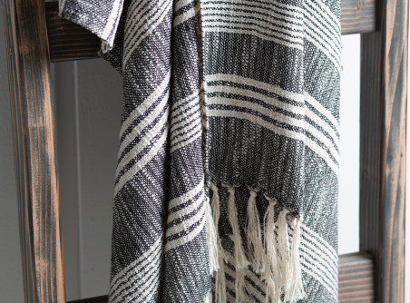
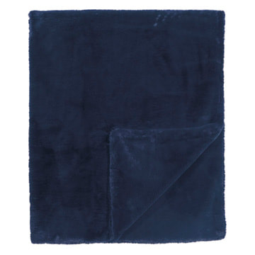
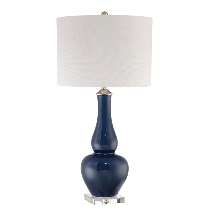
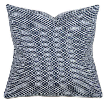
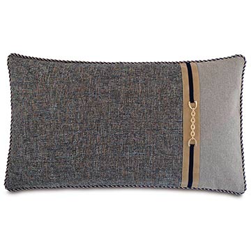
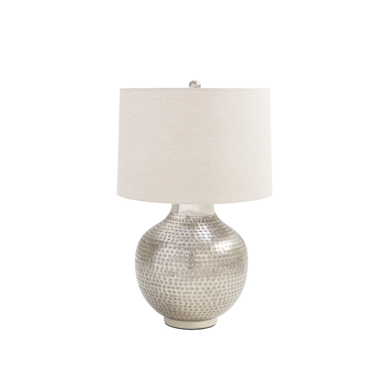
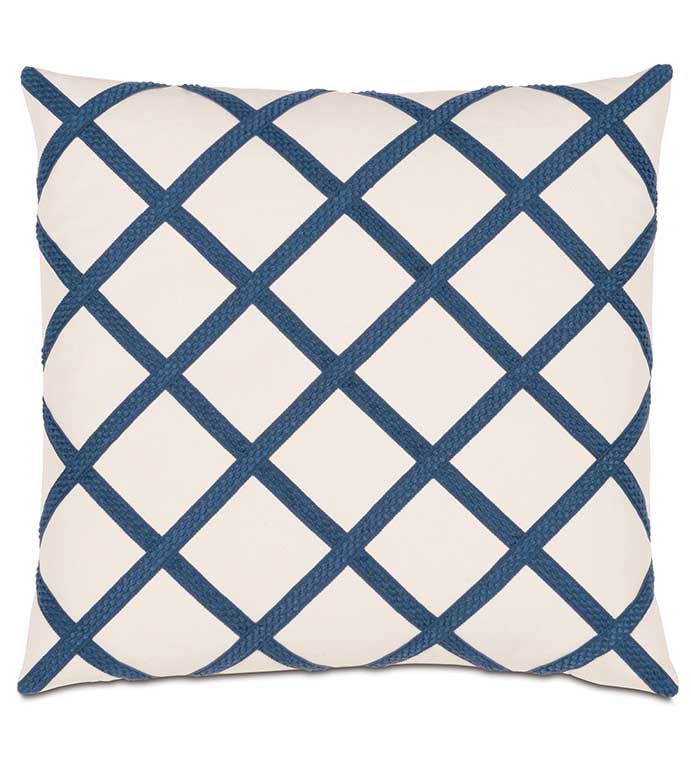
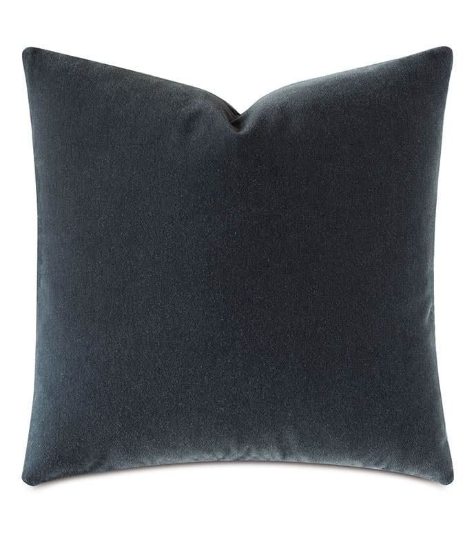
ACCESSORIZE WITH ART, LAMPS & THROWS
IN NAVY!
La-Z-Boy Gulf Coast
Designers
DESIGN CHAT BLOG
Decorating tips and sales by our In-Home Design Experts
at La-Z-Boy Gulf Coast stores. PLUS...sale announcements! Enjoy!
Archives
January 2024
December 2023
November 2023
October 2023
September 2023
August 2023
July 2023
June 2023
May 2023
April 2023
March 2023
February 2023
January 2023
December 2022
November 2022
October 2022
September 2022
August 2022
July 2022
June 2022
May 2022
April 2022
March 2022
February 2022
January 2022
December 2021
November 2021
October 2021
September 2021
August 2021
July 2021
June 2021
May 2021
April 2021
March 2021
February 2021
January 2021
December 2020
November 2020
October 2020
September 2020
August 2020
July 2020
Categories
All
AQUA
BLACK & WHITE
COLOR POPS
ESAC
GRAY
GREEN
HOME ART GALLERY
LIME GREEN
NAVY
NAVY & GREEN
NAVY & WHITE
ORANGE
PURPLE
PURPLE & LIME GREEN
SHABBY CHIC
THE LILAC CHASE
THE PRIMARIES
YELLOW
|
© Marks Interiors 2020
La-Z-Boy Gulf Coast Mon - Sat 10 AM - 6 PM Sunday. 1 PM - 5 PM |
MOBILE
3767 Airport Blvd. Mobile, AL 36608 251-341-1036 Directions |
SPANISH FORT
34000 Bass Pro Dr Spanish Fort, Al 36527 251-300-2020 Directions |
PENSACOLA
5078 Bayou Blvd Pensacola, FL 32503 850-479-9800 Directions |
































































 RSS Feed